
It started with a button (now we’re here)

Moritz
November 12, 2019
I don’t remember much about my first website.
It must have been around 1998, I was 12 years old and I wrote my HTML in a pirated copy of an IDE called Allaire HomeSite on my 133MHz Pentium machine running Windows 95. I got my first 56k dial-up modem for Christmas the year before and I spent way too much time online, which caused my grades to deteriorate and the phone bill to explode.
I do not remember where the site was hosted (must have been one of those free 1 MB web space services) nor do I remember what the URL was or what was really on it content-wise. But I do remember it had everything a 90s website had to have: a hit counter, a custom mouse cursor (a cartoon beaver with his arm as the pointer), the eternal under-construction.gif and most importantly: a splash page with a ginormous button that read “MOJO” in all caps. I don’t have these files anymore and, despite the popular saying, the internet forgot all about it. But here’s a realistic recreation of that button:
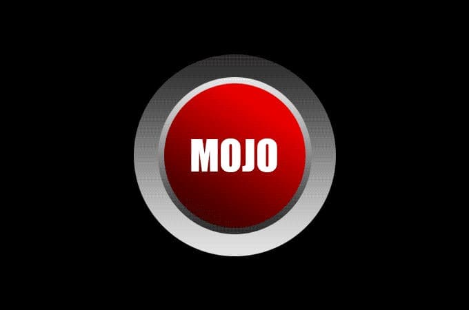
At this point I should clarify that “MoJo” was my online handle — my first name being Moritz and my middle name being Johannes. Go ahead and laugh, I’ll wait.
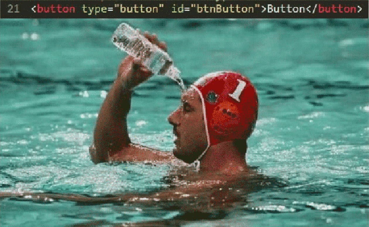
I remember using PaintShop Pro 5 to make the graphic, the markup probably looked a lot like this (back then HTML tags were written uppercase because it made them seem very important):
There are a few notable things about this button when you look at it in a 2019 context: Yes, it’s ugly and red. It’s not accessible at all (we’ll talk about why later), you definitely could improve the markup, and the label is rather cryptic. But oh boy does it beg to be clicked! Since that’s the only navigational option my visitors had at this point, I think I did a good job. What’s more tempting than to press the big red button?
Over the years web trends and technologies have come and gone but some things haven’t changed. How cool is it, that the code I wrote in 1998 would still perfectly render in any modern browser? To this day, buttons remain the UI designer’s best friend when the user should be called to an action*. In 1998 this implementation was totally fine. Nowadays, not so much.
TL;DR: building for the web isn’t easy anymore. As a novice, be thankful for the wrong paths your predecessors took, so you can do better now. As a senior netizen, be kind to those who still learn. The web is pretty complicated these days.
Buttons are the perfect example for that.
The biggest 90s lie since Milli Vanilli
Aside: are links buttons? Are buttons links?
One more thing before we start because some people can be nitpicky:
When I use the word button, I mean that in a graphic sense, so something that in its’ most basic form looks like this, regardless of implementation or semantics:
Marina Yalanska
To me, getting from one web page to another is “interactive feedback”. Clicking <a> elements is "the necessary command to achieve a particular goal" — navigating to another page. Whether the <a> is underlined text or styled like a button is secondary to me. I would argue, that — as long as the action is clearly identifiable — users don't care either way. Famously, Adam Silver takes more issue with this. While I find that to be a little too strict, I do agree with his opinion that buttons shouldn't have a hand cursor when they are <button>s. It is fine though, when they look like buttons but really are <a> elements. If all the best practices that will be discussed in this article are used, you don't need to worry about your cursor CSS property. The defaults are more or less correct.
So for the first part of this article I want to talk about buttons that look the part, regardless of their implementation. I will later discuss <button> the HTML element, but for now let's focus on appearance and not implementation.
So …
What makes a button look like a button?
As buttons are central in any UI, their appearance is a large part of what makes UI design zeitgeisty. For instance, when I uploaded that BUTTON.GIF to that FTP server in 1998, I probably had to click a few buttons that looked like this:

Windows 95
Operating systems at the time used a simple relief effect to make buttons stick out from their surroundings. In the early 90s, most computers were still limited in the amount of colors they could display*, so doing it by sheer color difference would not have been enough. Still, it looks kind of bland and the difference between primary and secondary buttons is very subtle.
A few years went by but not much changed (Windows XP, ca. 2001):

Windows XP
The button is still somewhat relief-y, the effect just got a little more of a polished feel to it. The difference between the two buttons is now emphasized by a light blue border. It’s better than before but still feels subtle.
I personally never used Windows XP, because in 2001 my mom bought me my first Apple Macintosh — an iMac G3 in the beautiful color of tangerine. A product design icon that had quite a few downsides: no floppy drive, no CD burner, and mostly: it came with MacOS 9.

Caption MacOS 9
MacOS < 10 (dubbed “classic”) was horribly unstable and software frequently crashed*. When it did, it took the whole system with it, so you could only hard reset the machine. When it was announced that Apple will completely overhaul their OS with version 10, I could not wait to try it. Some time in 2002 I got hold of a copy of 10.2 (Jaguar) and everything looked different:

MacOS X 10.2 (Jaguar)
Colors, textures, shadows, highlights, 3D! This candy look* started the defining UI design trend of the 2000s and was heavily copied and adapted by other designers. With Windows Vista (2007) even Microsoft used more color gradients in their buttons and an overall more shiny UI:

Windows Vista
By the way, two other things are noticeable for all the Mac screenshots I’ve shown you here: A) the designers at Apple made an effort to make the primary buttons more distinguishable than their Microsoft colleagues and B) the order of buttons is “cancel” on the left, “OK” on the right. This, like most things, is a matter of preference. I would argue for this order, because it ends with the dialog box’s conclusion, so to speak.
This is also only true when we talk about western languages that go from left to right. That’s why modern OSs reverse button order for RTL languages, like Hebrew. This is the save dialog in Mojave’s TextEdit.app for example:
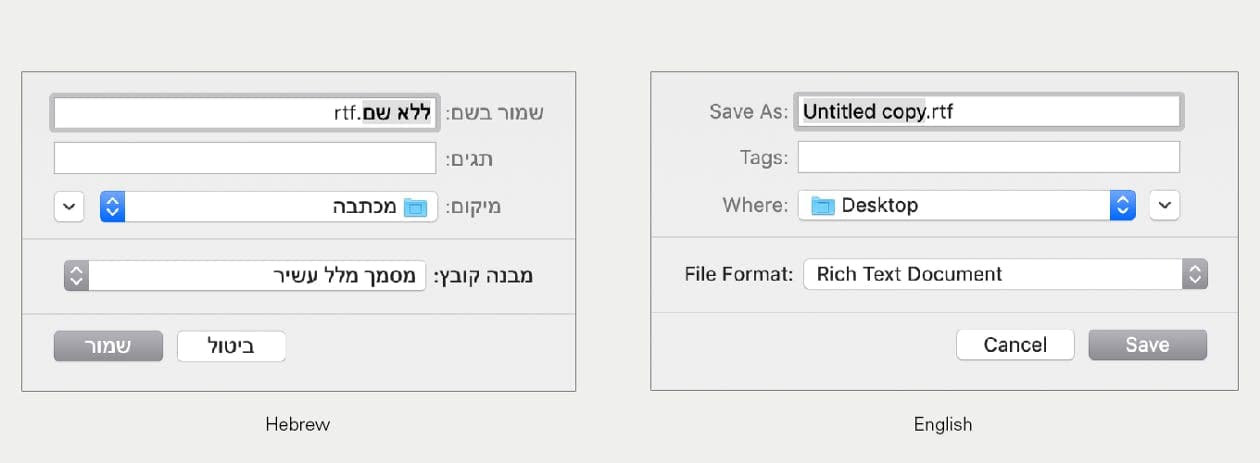
Notice how also every other UI component here is mirrored.
The whole 3D/candy trend continued well into the 2010s and was accompanied by skeuomorphic interfaces, something Apple kind of started* and then, after Steve Jobs had died, declared dead as well*.
I won’t go into more detail here ( this article is a good primer on the concept), but it’s the idea of graphical UIs mimicking the appearance and UX of actual physical objects.
Steve Jobs
according to Edward Muldrew, Prototypr.io blog, 2019–07–05
Some music production software suites (DAWs) take this concept to the extreme, such as Propellerhead’s Reason 9:
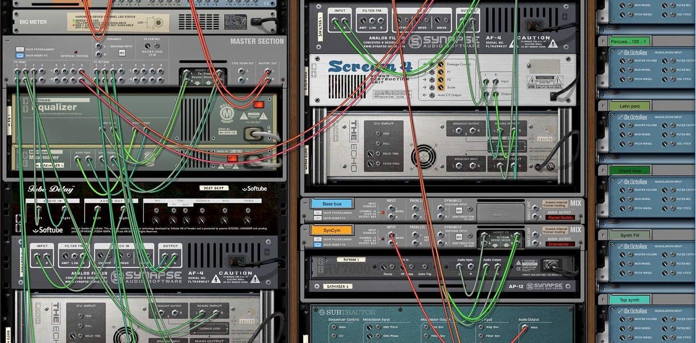
Disclaimer: I have used Reason, it’s a lot of fun!
Arguably, computer UI elements have always somewhat imitated the buttons and switches of real-world appliances, like calculators, light switches or hi-fi equipment. The quality of that mimicry had technological limits (availability of color, number of colors, graphic performance) for a long time. When it didn’t anymore, designers may have started to overcompensate.
Affordance like nobody’s watching
When a graphical element signifies that it can be used to do something, that’s called “affordance”:
Like my 1998 red enter button, the aforementioned UI buttons in Windows and MacOS all immediately look clickable. Especially in the context of their surroundings, they were designed to pop out. This — as most things in most forms of design — is a matter of visual balance. If everything pops out, nothing will. For example, my main issue with Reason is that some graphical elements look clickable even when they aren’t (screws, plugs, …). It is vital — yet not very difficult — to create a button design, that people will immediately recognize as “that’s a button, I’d click that.”
Quick aside: sometimes you see designers artificially lower the affordance of a button. We are now in the realms of dark design patterns, where a button has to be present (maybe for legal reasons), but you would not want any user to click it. I’m looking at you, Amazon’s “continue-without-prime” button*.
Let’s quickly complete our guided tour of button trends. With the end of the 2000s came flat design, a UI design movement that — influenced by Swiss International Typographic Style and Bauhaus — got rid of almost everything: no more shadows, no more gloss, no more gradients, only plain color buttons with text on them. Microsoft adopted this early with some of their products and designers everywhere fell in love with its simplicity. Unfortunately, it came with a significantly lowered affordance for most UI elements. That’s why Google invented Material Design in 2014: it tries to — among other things — bridge the gap between the aesthetic of flat design and better usability. It brought back subtle shadows and gradients, to let interface elements have more depth again.
Pro Tip™️: make your buttons look like buttons and don’t put decorative screws in your UIs.
Choose your words wisely
Say it’s 1998 you’ve stumbled upon my website. You’re greeted with a big red button that says “MOJO”. Naturally, you click it, it’s a big red button after all. But what would you have done, if it wasn’t as big and red? What would you expect from a small, blue button labeled “MOJO”? Something NSFW maybe?
If I could go back to give UX advice to my 12-year-old self, I’d say this: label buttons with what they do. It sounds trivial, but it’s a mistake you see a lot in software. It’s generally a good idea to internalize what is called the Principle of least astonishment:
A button’s label should clearly indicate its action. Don’t make it surprising what happens, when you click it.
How would I label this button now? Well, I would not use a splash page at all, but if I had to, I’d probably make it read “Enter website” or similar.
I will leave this topic with this real screenshot, courtesy of the rightfully discontinued Adobe Fireworks:
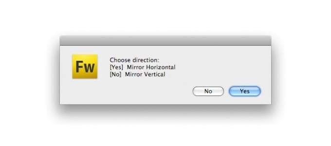
Just no.
Can’t touch this, naa nanana…
Another rather trivial observation: with the advent of smartphones and tablets, everything changed. Where mouse interfaces were difficult to learn (ask my mom) but easy to master (don’t ask my mom), touch interfaces were intuitive and came with a gentle learning curve but are notoriously imprecise in action*. Suddenly UI designers had to make buttons and other elements big enough for the average human sausage finger to hit. Here’s what Apple has to say about this:
Note, that Apple uses pt (points) as a unit and not px (pixels) since HiDPI/retina displays use 2 or more physical pixels to display 1 point. Converted to CSS units you can still speak of 44px.
I wonder what these meetings were like, when they decided to go with the 44 pt recommendation. Let’s do the math: the first iPhone had a resolution of 163 PPI (physical pixels per inch). That means, 44 Pixels roughly equal 7 mm. If you now look at the tip of your index finger, that sounds about right — for the first iPhone that is. My first smartphone (in 2011) had a resolution of 256 PPI. It was not shipped with a smaller index finger.
Steven Hoober
So yes, it is technically wrong. But if the saying is “technically correct is the best kind of correct”, then “technically wrong” should also be the best kind of wrong. 44px works as a rule of thumb (no pun intended). You still should always test your UIs on real devices with real users and real fingers.
If you want to find out how physical size, pixel dimensions, retina and screen resolution work together, I made this handy calculator for you. Use it on different devices to get a feeling of the differences.
A pressing issue becomes a touchy situation
Around 2012 I had a mantra: “Touch devices don’t have :hover states." I repeated it over and over, because clients insisted on hiding UI behind :hover interaction. They thought nothing of it, because before the advent of touch devices it used to be just fine. The classic example is what used to be called a "suckerfish dropdown menu":
The desirable navigation pattern of the early to mid-2000s
If you wanted to see the submenu on a touch device, you had to click the top-level item. Then the submenu appeared but the browser sent you to the page for that item and the submenu was gone again. Bad.
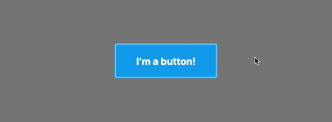
The same mantra goes for buttons: on touch devices, the :hover state will only be visible on click. Even if you would rather not show it at all. Look at this example. If you open it in your desktop browser, you get a beautiful blue button with a hover effect. Open it on your phone and the hover effect only appears when you click it (that is: tap with your finger). It even stays that way until you click somewhere else.
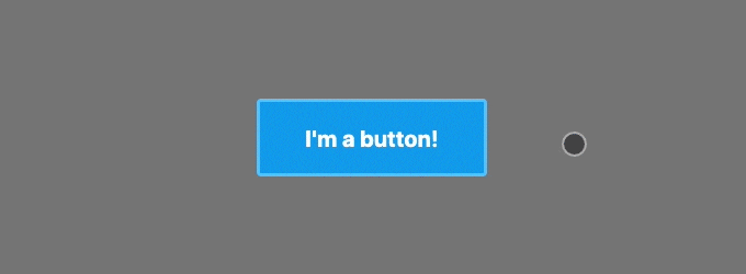
What is even worse is that iOS safari tried to deal with the lack of :hover on iPhones like this:
Nicholas C. Zakas
There are endless (1) posts (2) discussing (3) these problems and possible “solutions”. Most of them involve some kind of touch device detection. I try to stay away from those touch-only workarounds, since they are unreliable and not very robust*. I would rather avoid using hover for anything meaningful and only use these effects as little UI delights that don’t obstruct when they appear — and are harmless if they never trigger.
Speaking of undesirable styling of buttons — if you are reading this in Chrome: click that button again (or look at the GIF above)! See that blueish/grayish glow around it that appears after you click it? That wasn’t me… let me explain:
Hocus :focus
The :focus CSS pseudo-class represents an element (such as a form input) that has received focus. It is generally triggered when the user clicks or taps on an element or selects it with the keyboard's "tab" key.
When you clicked that button from before, Chrome’s default behavior is to not only apply :active during the click, but leave the button with the :focus pseudo-class in place. I used to despise this because it looks kind of ugly, but these days I enjoy it as a reminder to find a better styling for the :focus state of my UI elements.
There are two things you should keep in mind here:
#1: Don’t take :focus away
Since Chrome is the most used browser in the world, you can find this CSS snippet in many, many projects:
… and I mostly blame this post on stackoverflow for it. Designers have asked me to remove “that ugly blue glow” from their buttons countless times. The next section contains some passages in bold, consider me speaking quite loudly at that point:
Never, ever do this! It messes up the accessibility (or “a11y” for short) of your product for a lot of people. People who rely on assistive technology need to be able to navigate websites using the keyboard only! If you remove all styling for a focused button, they won’t be able to tell if they focused it or not! If you don’t like the default styling of :focus, please provide a clear and well-designed alternative!.
Also, if you really don’t want the browser to add :focus on click, in the near future you will be able to use :focus-visible instead. Browser support is still very bad, but you can polyfill it:
The styling you defined for that second selector will now only appear when you tab to the button, but not when you click it (try it in Chrome!):
If you want to see what good a11y in complex forms looks like, try to renew your passport as a citizen of the UK. Open it in chrome and fill it out using only the keyboard (tab button, enter button). When done right, a11y is so satisfying.
#2: Make your buttons <buttons type="button">
In the days of frontend frameworks/libraries like react, vuejs and others, you can make everything clickable. Consider this react component:
Nothing will stop you from doing this (apart from eslint-plugin-jsx-a11y maybe). It is bad for a11y because users of keyboard navigation will never be able to focus that “button” since it is just a <div>*.
Use a <button> instead and remove any unwanted styling via CSS.
The type="button" seems redundant, but the browser default is type="submit", which may lead to unexpected page reloads, so you should always explicitly set the type. (eslint-plugin-react will notify you if you don't).
This section’s take-home lesson: Buttons should be <button> (or <a> if they just link to some place). Eslint is your best friend.
Invisible text is invisible
Look at that 1998 markup again:
Let’s work with a version that’s a little more this millennium:
There’s another a11y issue with this: the text is embedded in the image. A screen reader will not know what it says, because the text is not part of the markup, thus making it unusable.
Fortunately, there’s a quick fix for this:
ARIA ( Accessible Rich Internet Applications) is a set of HTML attributes to provide a11y context where it is missing. aria-label is a rather simple example of this and if you haven't already, you should really learn more about how to use ARIA! Also note that I added an alt attribute to the <img> describing the image’s content*.
But even with an aria-label in place, it is generally still considered bad practice to embed text in images. These texts will also not be crawled by search engines, so imagine having a button that says "Buy $PRODUCT_NAME now!", the occurrence of the product name won't be considered for the SEO scoring.
Pro Tip™️: If you want to work on your product’s a11y but don’t have the time budget? Just sell it to your manager as important improvements in SEO!
Y’all got issues
This is a topic for an article in itself, but I do not want it to go unmentioned: everybody has trouble with something. A11y is not a marginal issue to cater to some tiny fringe group. I used to have perfect vision up until my late twenties but now am a little short-sighted. Without my glasses, small text is unreadable to me. I’m in need of a11y!
Imagine it’s summer and you’re sitting in the sun, trying to read text on your phone. Having trouble reading low contrast text? Lack of a11y!
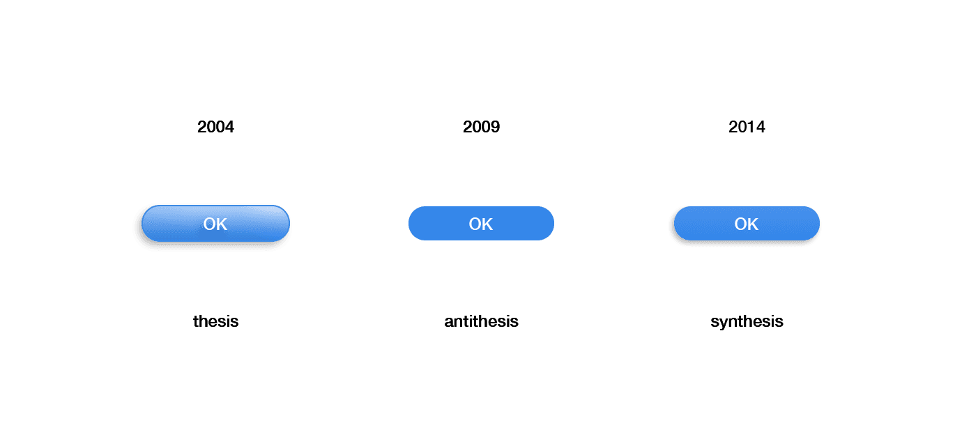
I (caucasian and male) stood about an 8% chance of being born color blind, the most common form of which is protanopia, a red-green deficiency. There’s an inherent lack of a11y when it comes to this topic*. Here’s an example, think of a shopping cart order process:
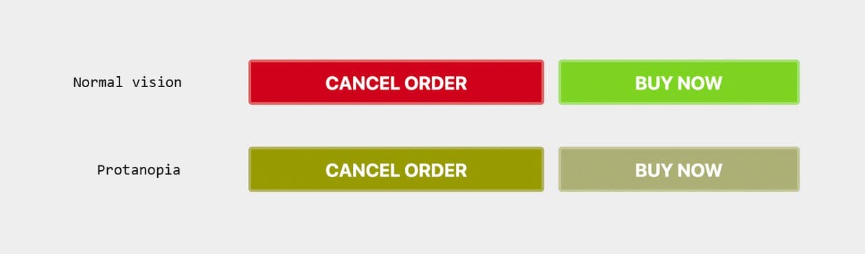
One might say: “but how bad is that really, the buttons are labeled?” — but think of how many times you have accidentally clicked the wrong button in a hurry. Sometimes users don’t really read UI copy. Even a 1% chance of accidentally losing conversion is an e-commerce nightmare.
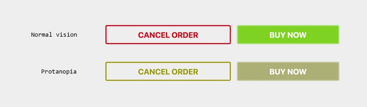
For “normal” sighted users the red and green buttons totally make sense. So why not use other kinds of styling differences to accommodate for everybody else? Here’s an approach using a so called ghost button:
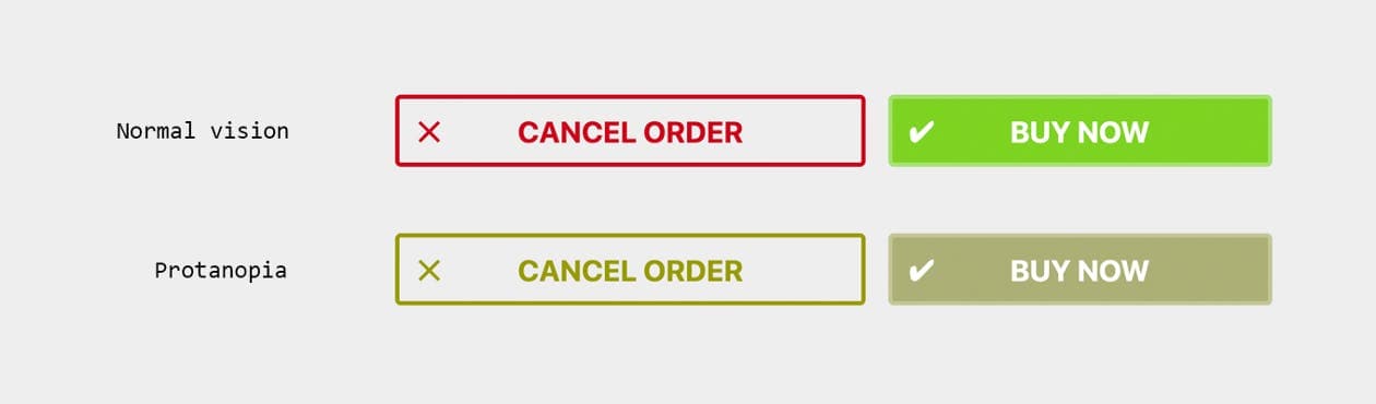
While you’re at it, why not add icons to the mix, making it even easier to identify the actions at a glance?
All of this is a huge and important topic, that has been covered by people far more experienced than me. Here (1) are (2) a few (3) resources (4).
Mr MOJO rising
So, to wrap this up, here’s a 2019 CSS-only implementation of that button. It still looks stupid, but it’s using all the best practices that I have learned in the last 21 years.
Boy, 21 years — two-thirds of my life so far — makes me wonder what we will say about this in the year 2040. Now, how do you embed these hit counters again?

Web Accessibilty A11y
Web Development
UI Design
History of Technology
Usability
Read also

Irena, 03/11/2026
Robotics in Balance: How digital solutions make physical processes smarter
Industry 4.0
Digital process optimization
Data visualization
Modular robotics solutions
Automation
Predictive maintenance
Smart Factory Software

Philipp, 03/11/2026
From Excel chaos to competitive advantage: established processes as the perfect foundation for B2B portals
Digital Transformation
Process Automation
Data Management
Custom Software Development
Business Process Digitization

Niklas, 03/09/2026
Are Passkeys Ready for Prime Time? – The Security Perspective (Part 1)
Passkeys
Passwords
Passwordless Authentication
Public-Key Cryptography
Challenge-Response Authentication